
Eva.C
Let’s Chat
What is Malv Consulting?
Malv Consulting is a committed Financial Planner for families who are looking for property investments or optimising retirement savings for maximum growth.
Industries
Property Investment, Finance, Consultancy

Location
Sydney, Australia
Team Composition
UI/UX Designer (That’s me 👋🏻)
Project Timeframe
2 Weeks
Context
This project was a design challenge completed as part of an interview process for a design consultant role at Hustle Agency. I was tasked with executing a comprehensive digital overhaul for Malv Consulting’s homepage.
The primary goal is to fundamentally shift Malv Consulting brand language to feel more modern, authentic, and experienced, while specifically optimising the digital experience for higher volume and quality of inbound leads.
Opportunities
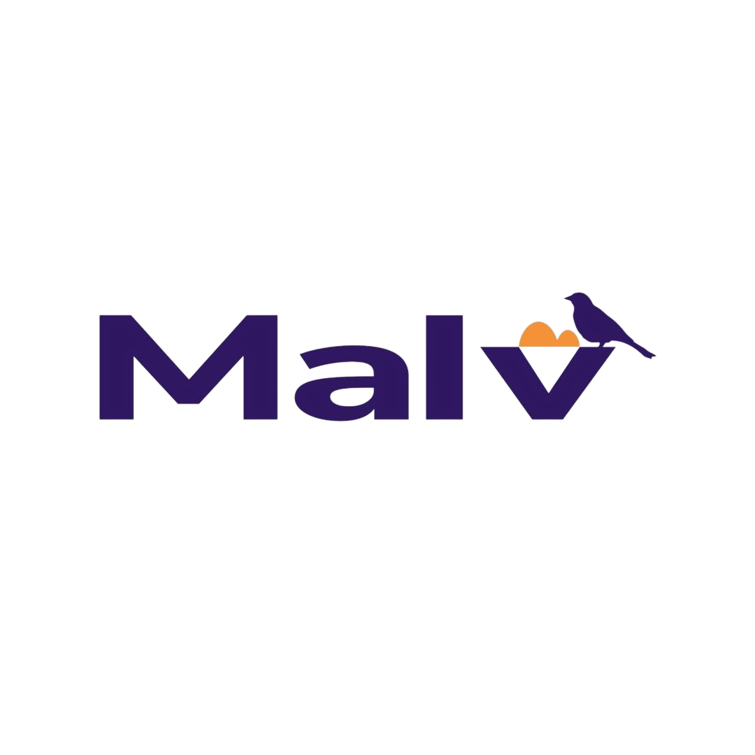
Use the hills and bird in the logo to bring out family-oriented vibe.

Introduce different layouts for each section to get rid of the left-right boredom.

Add qualitative and quantitive social proofs to show capabilities.

Create a minimal footer for clear navigation and page scalability.
Competitive Benchmarking
Before diving into design, I conducted a landscape audit in FigJam of some property investment, loan, or morgage platforms that have similar business goals to identify industry standards and market gaps. My goal was to see how Malv could differentiate itself while meeting the brief's requirement to be "authentic, experienced, and friendly".
Category
Pros (What to Adopt)
Cons (What to Avoid)
Trust &
Authority
Quantitative Proof:
Heavy use of "Hard Stats" (e.g., $3.1Bn+ total property value) and Google Reviews to provide social proof.
High Cognitive Load:
Information-dense and repeated layouts can overwhelm a user rather than guide them.
User
Journey
Transparent Process:
Clearly listing the investment journey and including "How it Works" sections to expose the service.
Generic Layouts:
A lack of "breathing space" between sections made some sites feel like standard templates rather than bespoke consulting.
Feature
Set
Sneak Peeks:
Showcasing specific property value increases to provide tangible evidence of expertise.
Stock Photo Overload:
Relying on generic business imagery that fails to communicate an "authentic" brand story.
Visual
Identity
Cinematic Full Bleed Background:
Use of "Airbnb-style" or “relatable” imagery to build an immediate personal connection.
Clinical & Cold:
Many sites felt overly "dark" or sterile, lacking the warmth required to build trust with families.
Strategic Shift: Information Architecture(IA)
To transform the Malv Consulting homepage into a high-converting digital experience, I fundamentally restructured the information architecture based on the competitive benchmarking audit. This shift moved the narrative from a "Feature-Led" approach to a "Trust-Led" journey.
The original layout focused heavily on services early on, which I reordered and added additional sections to prioritise emotional resonance before asking for the conversion.
Original
(Feature-Led)
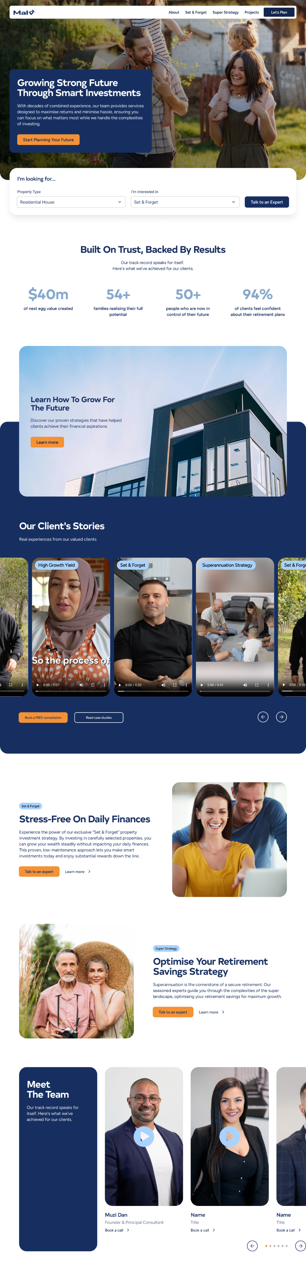
Hero Section
Service 1
(Set & Forget)
Service 2
(Superannuation)
Portfolio
Why choose Malv Consulting
Footer with
Contact Form
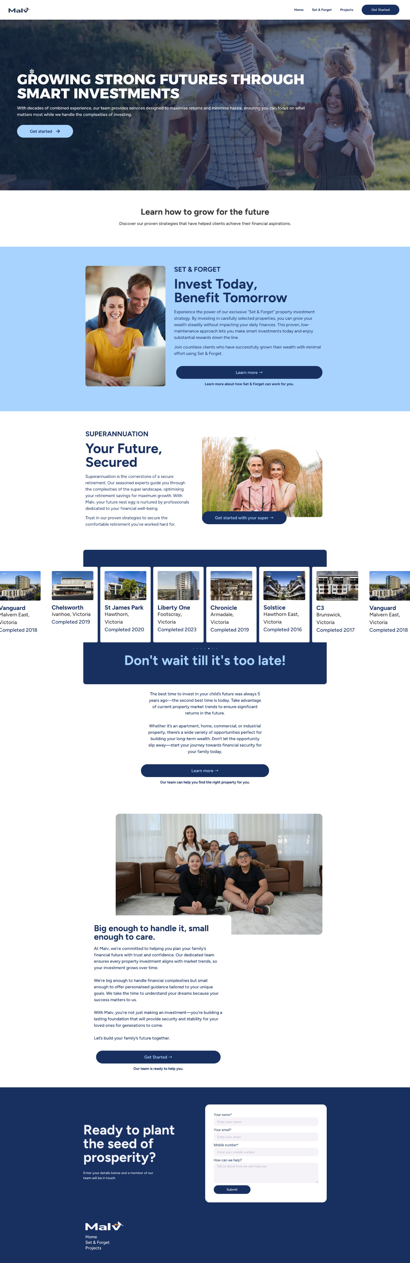
Adjusted IA
(Trust-Led)
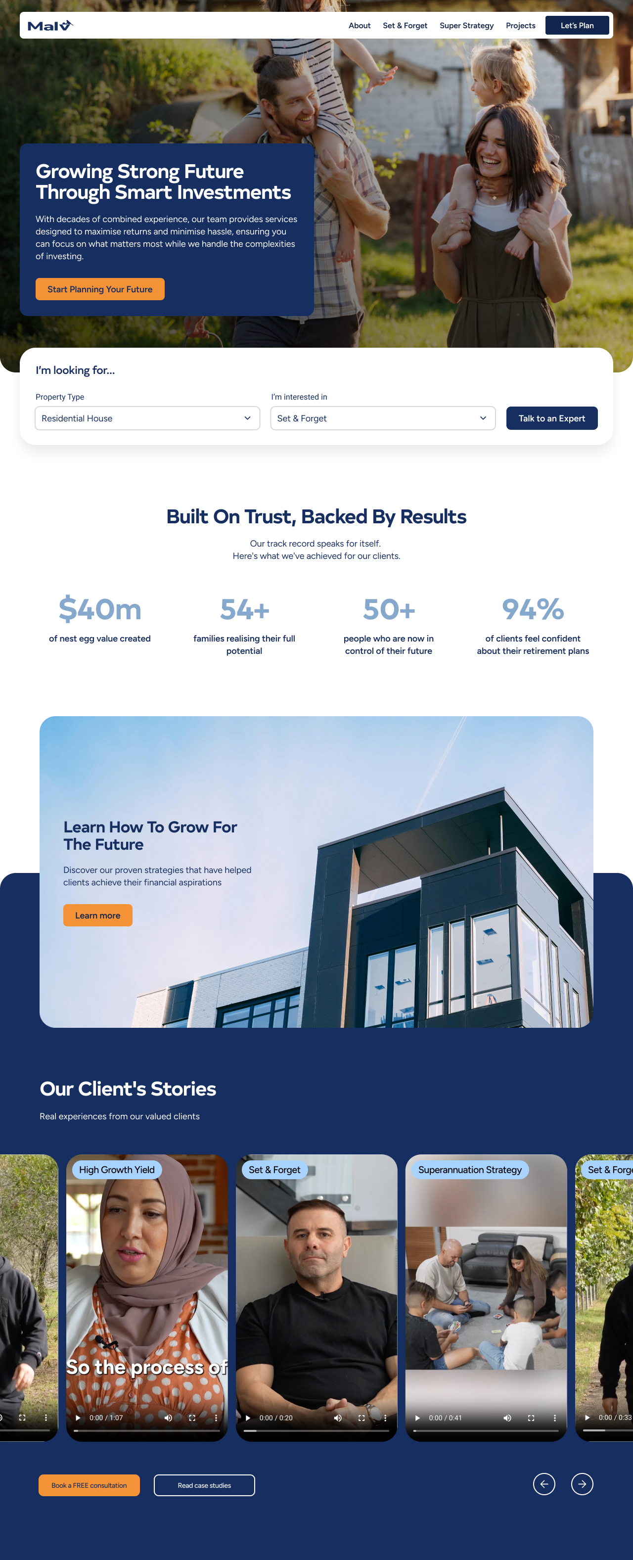
Hero Section
Key Statistics
1st Conversion Point with CTA
Testimonials
Service 1
(Set & Forget)
Service 2
(Superannuation)
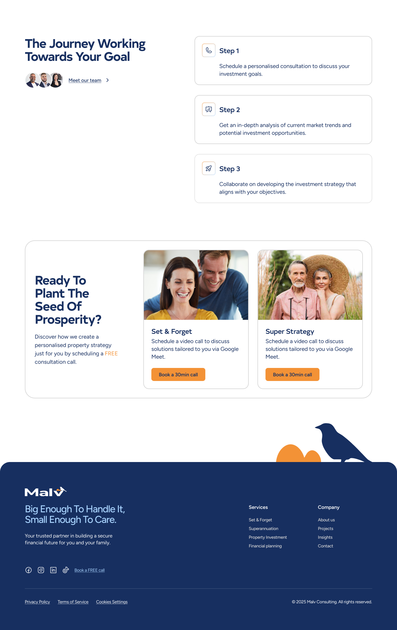
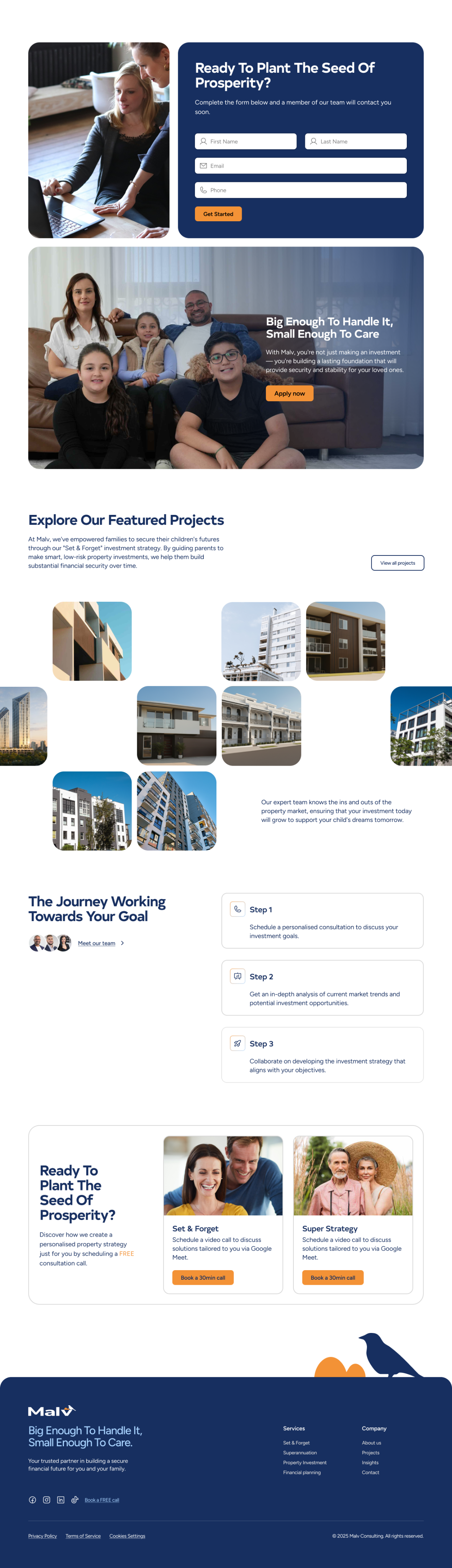
Meet the Team
2nd Conversion Point with Contact Form
Portfolio
Investment Journey
Walk-through
3rd Conversion Point with CTA
Footer
Key Statistics: Quantitative Proof of SuccessProvides immediate "quantitative social proof" that establishes Malv Consulting as an industry leader.
Testimonials: Authentic Success StoriesFeatures success stories to showcase the real-world impact of Malv’s services on real clients and families.
Meet the Team: Establishing AuthenticityThis section introduces the specialised consultants, fulfilling the goal of making the brand feel "experienced" and "legitimate".
Investment Journey: A Transparent ProcessWalks through “how it works” from initial consultation to property acquisition, encouraging users to take the next step with confidence.
Lead Generation: Mid-Scroll EngagementThese CTAs ensure that as soon as a user feels "inspired" by the stats or stories, they have an immediate path to conversion.
Visual Language: Balancing Authority with Approachability
The visual language of the new Malv Consulting homepage was built on a foundation of trust(navy #172F60), drew attention with high-energy conversion points(orange #F39236) and soften styling(32px corner roundness).
By combining the authority of Navy with the vibrancy of Orange and the softness of 32px curves, I created a homepage that looks "premium" while remaining approachable. This balance ensures that potential clients feel Malv Consult is both capable of growing their wealth and "friendly" enough to care about their family's future.
#FFFFFF
#172F60
#A8D3FF
#F39236
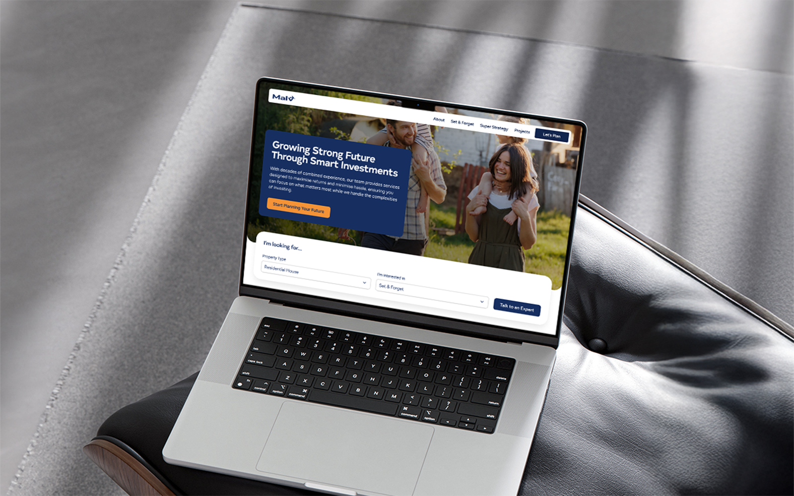
Final Design

Eva Chiu
Let’s Chat
What is Malv Consulting?
Malv Consulting is a committed Financial Planner for families who are looking for property investments or optimising retirement savings for maximum growth.
Industries
Property Investment, Finance, Consultancy

Location
Sydney, Australia
Team Composition
UI/UX Designer (That’s me 👋🏻)
Project Timeframe
2 Weeks
Context
This project was a design challenge completed as part of an interview process for a design consultant role at Hustle Agency. I was tasked with executing a comprehensive digital overhaul for Malv Consulting’s homepage.
The primary goal is to fundamentally shift Malv Consulting brand language to feel more modern, authentic, and experienced, while specifically optimising the digital experience for higher volume and quality of inbound leads.
Opportunities
Use the hills and bird in the logo to bring out family-oriented vibe.

Introduce different layouts for each section to get rid of the left-right boredom.

Add qualitative and quantitive social proofs to show capabilities.

Create a minimal footer for clear navigation and page scalability.
Competitive Benchmarking
Before diving into design, I conducted a landscape audit in FigJam of some property investment, loan, or morgage platforms that have similar business goals to identify industry standards and market gaps. My goal was to see how Malv could differentiate itself while meeting the brief's requirement to be "authentic, experienced, and friendly".
Category
Pros (What to Adopt)
Cons (What to Avoid)
Trust & Authority
Quantitative Proof:
Heavy use of "Hard Stats" (e.g., $3.1Bn+ total property value) and Google Reviews to provide social proof.
High Cognitive Load:
Information-dense and repeated layouts can overwhelm a user rather than guide them.
User Journey
Transparent Process:
Clearly listing the investment journey and including "How it Works" sections to expose the service.
Generic Layouts:
A lack of "breathing space" between sections made some sites feel like standard templates rather than bespoke consulting.
Feature Set
Sneak Peeks:
Showcasing specific property value increases to provide tangible evidence of expertise.
Stock Photo Overload:
Relying on generic business imagery that fails to communicate an "authentic" brand story.
Visual Identity
Cinematic Full Bleed Background:
Use of "Airbnb-style" or “relatable” imagery to build an immediate personal connection.
Clinical & Cold:
Many sites felt overly "dark" or sterile, lacking the warmth required to build trust with families.
Strategic Shift: Information Architecture(IA)
To transform the Malv Consulting homepage into a high-converting digital experience, I fundamentally restructured the information architecture based on the competitive benchmarking audit. This shift moved the narrative from a "Feature-Led" approach to a "Trust-Led" journey.
The original layout focused heavily on services early on, which I reordered and added additional sections to prioritise emotional resonance before asking for the conversion.
Original
(Feature-Led)
Hero Section
Service 1
(Set & Forget)
Service 2
(Superannuation)
Portfolio
Why choose Malv Consulting
Footer with
Contact Form
Adjusted IA
(Trust-Led)
Hero Section
Key Statistics
1st Conversion Point with CTA
Testimonials
Service 1
(Set & Forget)
Service 2
(Superannuation)
Meet the Team
2nd Conversion Point with Contact Form
Portfolio
Investment Journey
Walk-through
3rd Conversion Point with CTA
Footer
Key Statistics: Quantitative Proof of SuccessProvides immediate "quantitative social proof" that establishes Malv Consulting as an industry leader.
Testimonials: Authentic Success StoriesFeatures success stories to showcase the real-world impact of Malv’s services on real clients and families.
Meet the Team: Establishing AuthenticityThis section introduces the specialised consultants, fulfilling the goal of making the brand feel "experienced" and "legitimate".
Investment Journey: A Transparent ProcessWalks through “how it works” from initial consultation to property acquisition, encouraging users to take the next step with confidence.
Lead Generation: Mid-Scroll EngagementThese CTAs ensure that as soon as a user feels "inspired" by the stats or stories, they have an immediate path to conversion.
Visual Language: Balancing Authority with Approachability
The visual language of the new Malv Consulting homepage was built on a foundation of trust(navy #172F60), drew attention with high-energy conversion points(orange #F39236) and soften styling(32px corner roundness).
By combining the authority of Navy with the vibrancy of Orange and the softness of 32px curves, I created a homepage that looks "premium" while remaining approachable. This balance ensures that potential clients feel Malv Consult is both capable of growing their wealth and "friendly" enough to care about their family's future.
#FFFFFF
#172F60
#F39236
#A8D3FF
Final Design
Eva Chiu
Let’s Chat
Malv Consulting is a committed Financial Planner for families who are looking for property investments or optimising retirement savings for maximum growth.
What is Malv Consulting?
Industries
Property Investment, Finance, Consultancy

Location
Sydney, Australia
Team Composition
UI/UX Designer (That’s me 👋🏻)
Project Timeframe
2 Weeks
Context
This project was a design challenge completed as part of an interview process for a design consultant role at Hustle Agency. I was tasked with executing a comprehensive digital overhaul for Malv Consulting’s homepage.
The primary goal is to fundamentally shift Malv Consulting brand language to feel more modern, authentic, and experienced, while specifically optimising the digital experience for higher volume and quality of inbound leads.
Opportunities
Use the hills and bird in the logo to bring out family-oriented vibe.
Introduce different layouts for each section to get rid of the left-right boredom.
Add qualitative and quantitive social proofs to show capabilities.

Create a minimal footer for clear navigation and page scalability.
Competitive Benchmarking
Before diving into design, I conducted a landscape audit in FigJam of some property investment, loan, or mortgage platforms that have similar business goals to identify industry standards and market gaps. My goal was to see how Malv could differentiate itself while meeting the brief's requirement to be "authentic, experienced, and friendly".
Category
Pros (What to Adopt)
Cons (What to Avoid)
Trust & Authority
Quantitative Proof:
Heavy use of "Hard Stats" (e.g., $3.1Bn+ total property value) and Google Reviews to provide social proof.
High Cognitive Load:
Information-dense and repeated layouts can overwhelm a user rather than guide them.
User Journey
Transparent Process:
Clearly listing the investment journey and including "How it Works" sections to expose the service.
Generic Layouts:
A lack of "breathing space" between sections made some sites feel like standard templates rather than bespoke consulting.
Feature Set
Sneak Peeks:
Showcasing specific property value increases to provide tangible evidence of expertise.
Stock Photo Overload:
Relying on generic business imagery that fails to communicate an "authentic" brand story.
Visual Identity
Cinematic Full Bleed Background:
Use of "Airbnb-style" or “relatable” imagery to build an immediate personal connection.
Clinical & Cold:
Many sites felt overly "dark" or sterile, lacking the warmth required to build trust with families.
Strategic Shift: Information Architecture(IA)
To transform the Malv Consulting homepage into a high-converting digital experience, I fundamentally restructured the information architecture based on the competitive benchmarking audit. This shift moved the narrative from a "Feature-Led" approach to a "Trust-Led" journey.
The original layout focused heavily on services early on, which I reordered and added additional sections to prioritise emotional resonance before asking for the conversion.
Original
(Feature-Led)
Hero Section
Service 1
(Set & Forget)
Service 2
(Superannuation)
Portfolio
Why choose Malv Consulting
Footer with
Contact Form
Adjusted IA
(Trust-Led)
Hero Section
Key Statistics
1st Conversion Point with CTA
Testimonials
Service 1
(Set & Forget)
Service 2
(Superannuation)
Meet the Team
2nd Conversion Point with Contact Form
Portfolio
Investment Journey
Walk-through
3rd Conversion Point with CTA
Footer
Key Statistics: Quantitative Proof of SuccessProvides immediate "quantitative social proof" that establishes Malv Consulting as an industry leader.
Testimonials: Authentic Success StoriesFeatures success stories to showcase the real-world impact of Malv’s services on real clients and families.
Meet the Team: Establishing AuthenticityThis section introduces the specialised consultants, fulfilling the goal of making the brand feel "experienced" and "legitimate".
Investment Journey: A Transparent ProcessWalks through “how it works” from initial consultation to property acquisition, encouraging users to take the next step with confidence.
Lead Generation: Mid-Scroll EngagementThese CTAs ensure that as soon as a user feels "inspired" by the stats or stories, they have an immediate path to conversion.
Visual Language: Balancing Authority with Approachability
The visual language of the new Malv Consulting homepage was built on a foundation of trust(navy #172F60), drew attention with high-energy conversion points(orange #F39236) and soften styling(32px corner roundness).
By combining the authority of Navy with the vibrancy of Orange and the softness of 32px curves, I created a homepage that looks "premium" while remaining approachable. This balance ensures that potential clients feel Malv Consult is both capable of growing their wealth and "friendly" enough to care about their family's future.
#FFFFFF
#172F60
#F39236
#A8D3FF
Final Design
Eva Chiu
Let’s Chat
Malv Consulting is a committed Financial Planner for families who are looking for property investments or optimising retirement savings for maximum growth.
What is Malv Consulting?
Industries
Property Investment, Finance, Consultancy

Location
Sydney, Australia
Team Composition
UI/UX Designer (That’s me 👋🏻)
Project Timeframe
2 Weeks
Context
This project was a design challenge completed as part of an interview process for a design consultant role at Hustle Agency. I was tasked with executing a comprehensive digital overhaul for Malv Consulting’s homepage.
The primary goal is to fundamentally shift Malv Consulting brand language to feel more modern, authentic, and experienced, while specifically optimising the digital experience for higher volume and quality of inbound leads.
Opportunities
Use the hills and bird in the logo to bring out family-oriented vibe.
Introduce different layouts for each section to get rid of the left-right boredom.
Add qualitative and quantitive social proofs to show capabilities.
Create a minimal footer for clear navigation and page scalability.
Competitive Benchmarking
Before diving into design, I conducted a landscape audit in FigJam of some property investment, loan, or morgage platforms that have similar business goals to identify industry standards and market gaps. My goal was to see how Malv could differentiate itself while meeting the brief's requirement to be "authentic, experienced, and friendly".
Category
Pros (What to Adopt)
Cons (What to Avoid)
Trust & Authority
Quantitative Proof:
Heavy use of "Hard Stats" (e.g., $3.1Bn+ total property value) and Google Reviews to provide social proof.
High Cognitive Load:
Information-dense and repeated layouts can overwhelm a user rather than guide them.
User Journey
Transparent Process:
Clearly listing the investment journey and including "How it Works" sections to expose the service.
Generic Layouts:
A lack of "breathing space" between sections made some sites feel like standard templates rather than bespoke consulting.
Feature Set
Sneak Peeks:
Showcasing specific property value increases to provide tangible evidence of expertise.
Stock Photo Overload:
Relying on generic business imagery that fails to communicate an "authentic" brand story.
Visual Identity
Cinematic Full Bleed Background:
Use of "Airbnb-style" or “relatable” imagery to build an immediate personal connection.
Clinical & Cold:
Many sites felt overly "dark" or sterile, lacking the warmth required to build trust with families.
Strategic Shift: Information Architecture(IA)
To transform the Malv Consulting homepage into a high-converting digital experience, I fundamentally restructured the information architecture based on the competitive benchmarking audit. This shift moved the narrative from a "Feature-Led" approach to a "Trust-Led" journey.
The original layout focused heavily on services early on, which I reordered and added additional sections to prioritise emotional resonance before asking for the conversion.
Original
(Feature-Led)
Hero Section
Service 1
(Set & Forget)
Service 2
(Superannuation)
Portfolio
Why choose Malv Consulting
Footer with
Contact Form
Adjusted IA
(Trust-Led)
Hero Section with
Service Navigation
Key Statistics
1st Conversion Point with CTA
Testimonials
Service 1
(Set & Forget)
Service 2
(Superannuation)
Meet the Team
2nd Conversion Point with Contact Form
Portfolio
Investment Journey
Walk-through
3rd Conversion Point with CTA
Footer
Key Statistics: Quantitative Proof of SuccessProvides immediate "quantitative social proof" that establishes Malv Consulting as an industry leader.
Data MappingCollaborate with engineers to determine if the underlying LLM has enough clinical terminologies to categorise three auditable work streams and define requirements for "Keyword-to-Timestamp" mapping accuracy.
Data MappingCollaborate with engineers to define requirements for "Keyword-to-Timestamp" mapping accuracy and determine if the underlying LLM can categorise three auditable work streams
Meet the Team: Establishing AuthenticityThis section introduces the specialised consultants, fulfilling the goal of making the brand feel "experienced" and "legitimate".
Investment Journey: A Transparent ProcessWalks through “how it works” from initial consultation to property acquisition, encouraging users to take the next step with confidence.
Lead Generation: Mid-Scroll EngagementThese CTAs ensure that as soon as a user feels "inspired" by the stats or stories, they have an immediate path to conversion.
Visual Language: Balancing Authority with Approachability
The visual language of the new Malv Consulting homepage was built on a foundation of trust(navy #172F60), drew attention with high-energy conversion points(orange #F39236) and soften styling(32px corner roundness).
By combining the authority of Navy with the vibrancy of Orange and the softness of 32px curves, I created a homepage that looks "premium" while remaining approachable. This balance ensures that potential clients feel Malv Consult is both capable of growing their wealth and "friendly" enough to care about their family's future.
#FFFFFF
#172F60
#F39236
#A8D3FF
Final Design