
Eva.C
Let’s Chat
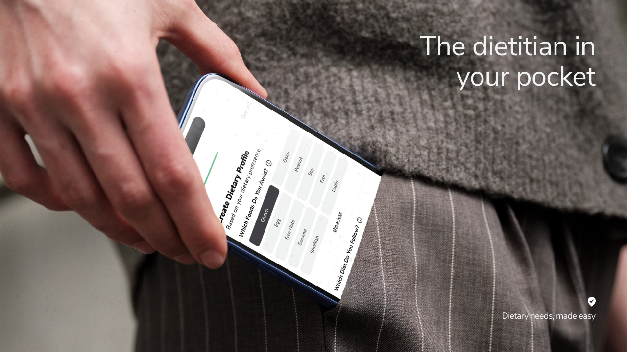
What is Foodini?
Foodini is an AI-driven personalised dietary menu finder powered by accredited practising dietitian.

Industries
Technology, Hospitality, Lifestyle

Location
Launched in Los Angeles, USA
Designed in Sydney, Australia
Team Composition
Chief Operation Officer,
Head of Dietitian,
Head of Technology,
1 Senior Backend Engineer,
1 UI/UX Designer(That’s me 👋🏻)
Project Timeframe
9 Months
Design System
Flutter
Impact
7x
Weekly Installation Growth in 6 months
2880+ users with a 5.8% accumulative growth rate on installations.
4000+
Venues Available on the platform
Including leading restaurants and hotels, such as Crown Melbourne, Sweetgreen, RMD Group, Marriott.
150+
Diets & Allergens Covered
Met SB68 compliance requirements and working towards including calories and nutrition facts.
Foodini was established in 2021 in response to the prevalence of food allergies and hassle involved in finding suitable food.
As the company looks to scale globally, its outdated UI and UX need a refresh to excite consumers worldwide.
Timeline
2024
April

May
June
July
August
September
October
November
Research
UI/UX Designer
Brainstorm
COO, Dietitian, UI/UX Designer
Wireframes & Iterations
UI/UX Designer
Hi-Fi Designs
UI/UX Designer
Development
CTO & Senior Backend Engineer
Testing
Whole team
Friction Points
“ Right idea,
layout needs work.

— The idea behind the app is good but the layout and usability is awkward. Not very intuitive to update dietary preference. (App Store Review)


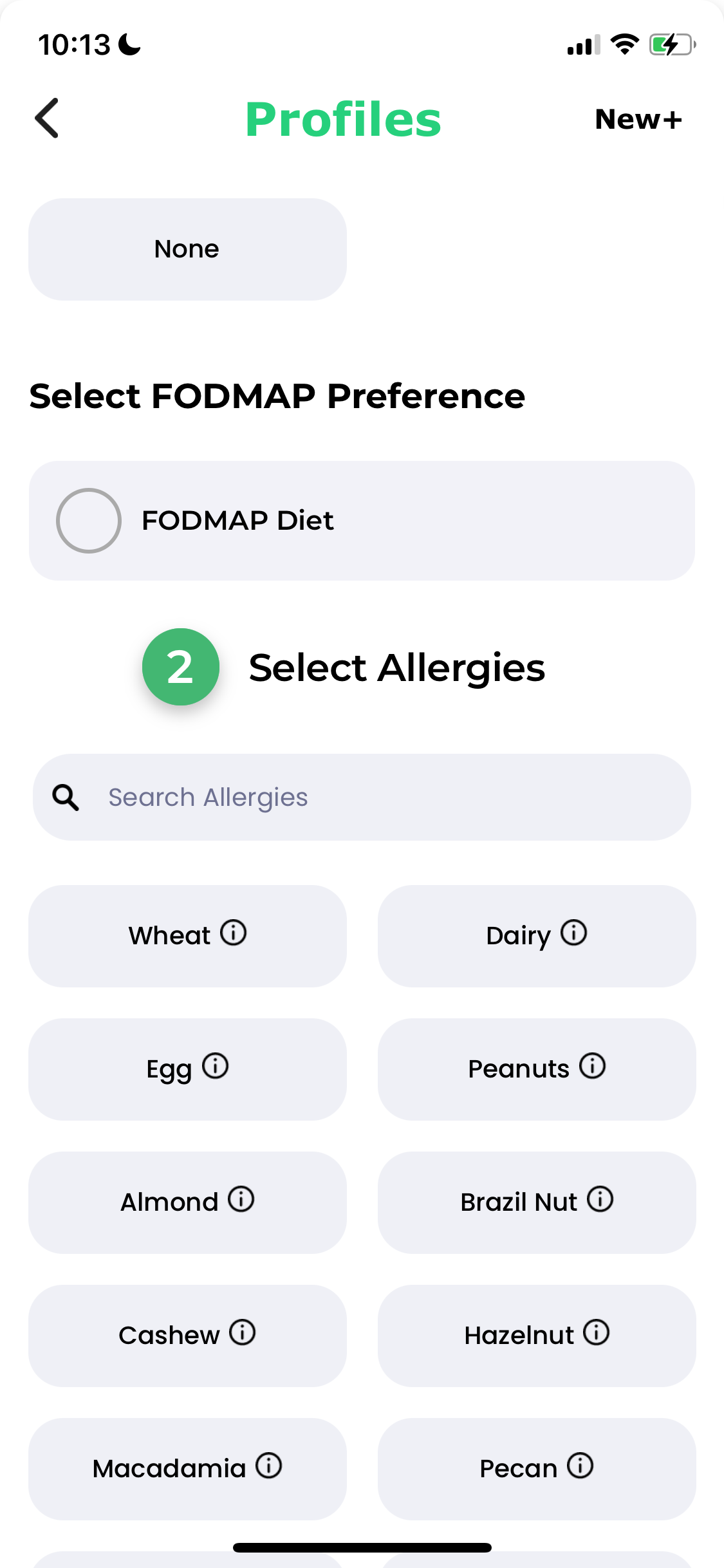

Suboptimal Prioritisation of Critical Information
The "Select eating preferences" section is placed above "Select allergies." For users with severe allergies, selection of allergen avoidance is more critical and should arguably be prioritised for immediate visibility.
The current section order delays users from inputting their most vital safety information, causing frustration and a feeling that the app doesn't immediately address their primary concern.


Misapplication of the Brand Colour
The app pervasively uses the brand colour green for both dietary selections and allergen exclusions. Green typically indicates positive selection, but here it's also used to mark foods users want to avoid.
This contradictory visual language can lead to confusion and compromise the user's ability to quickly and accurately identify critical dietary restrictions.


Limited Clarity of Interaction and User Expectation
By placing an information icon within selection buttons, the app conflates two distinct actions – selecting an item and accessing supplementary information – into a single, ambiguous tap target. Users may accidentally select/deselect an allergy when seeking information, leading to confusion and hindering predictable interaction, particularly crucial in an app handling sensitive dietary restrictions.
This design choice contradicts user expectations, as tapping a button is intuitively understood to trigger its primary function.


Inconsistency in Visual Language and Interaction Patterns
The design is using two distinctive UIs, toggles for binary "on/off" FODMAP preferences and rectangular buttons for allergies or general eating preferences) to serve the same ‘tapping to select’ action.
Plus, the green ‘exclude’ text next to the toggles does not respond to the on/off interaction.
Users struggle to quickly understand the precise nature and implication of their action (do I turn a feature on/off successfully?), leading to a less intuitive experience.
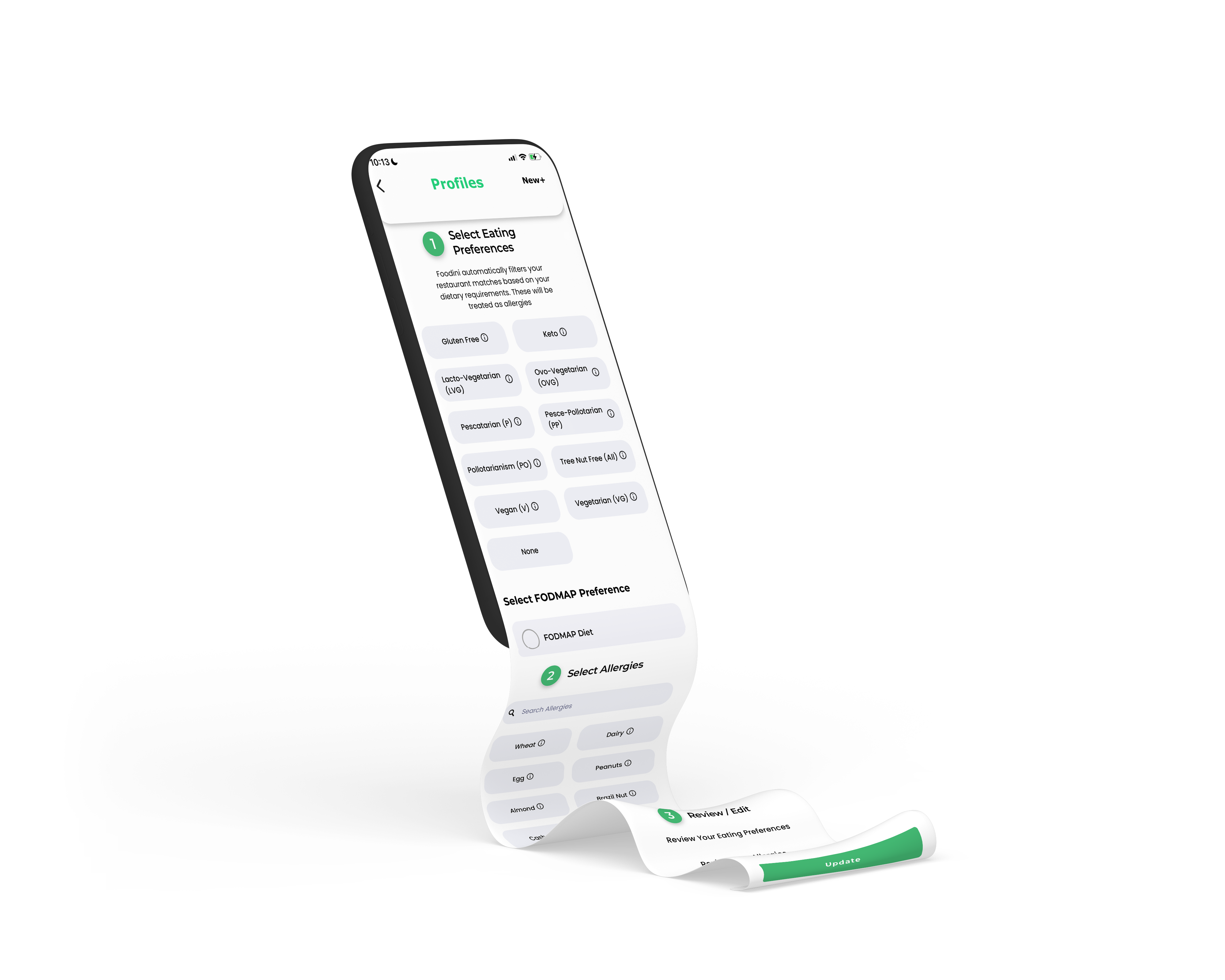
Diminished goal gradient effect and User Fatigue
By having all dietary categories on a single, long screen with the proceed CTA button at the very bottom, the user lacks a clear visual indication of how much progress they've made or how much remains to be done. They don't see the "finish line" getting closer.
This decreases users’ initial motivation because the reward (a completed profile) seems distant and requires a lot of effort to reach.


Lack of User Control
When a user chooses an eating preference, the system automatically pre-selects corresponding allergies in the 'Select Allergies' section. However, users cannot deselect these auto-selected allergies, which frustrates them and undermines their sense of control.

Low Visual Hierarchy and Less Refined Layout
The inconsistency on paddings and over-reliance on the brand green colour created a less refined interface appearance.
This creates a disconnection between what users want to do and what the system allows, limiting their ability to manage their own dietary preferences.

Appropriate padding would better distinguish between different information sections and enhance overall readability.

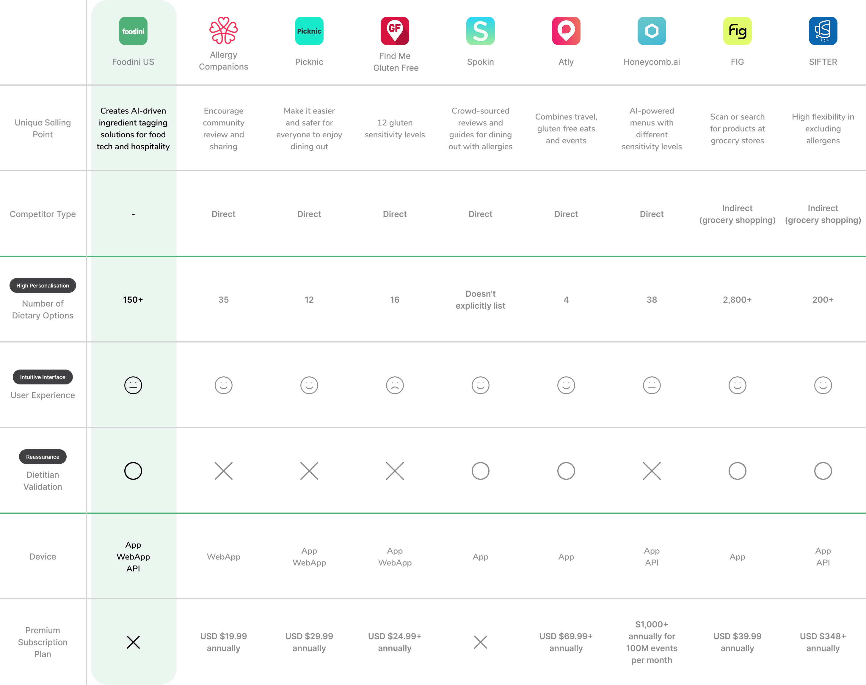
Competitor
Analysis
Dietary needs are personal and unique to each individual, requiring:
High Personalisation
Comprehensive dietary options
Intuitive Navigation
Easily selecting/editing dietary preferences
Reassurance
Feeling understood by the technology and reassured with dietitian support
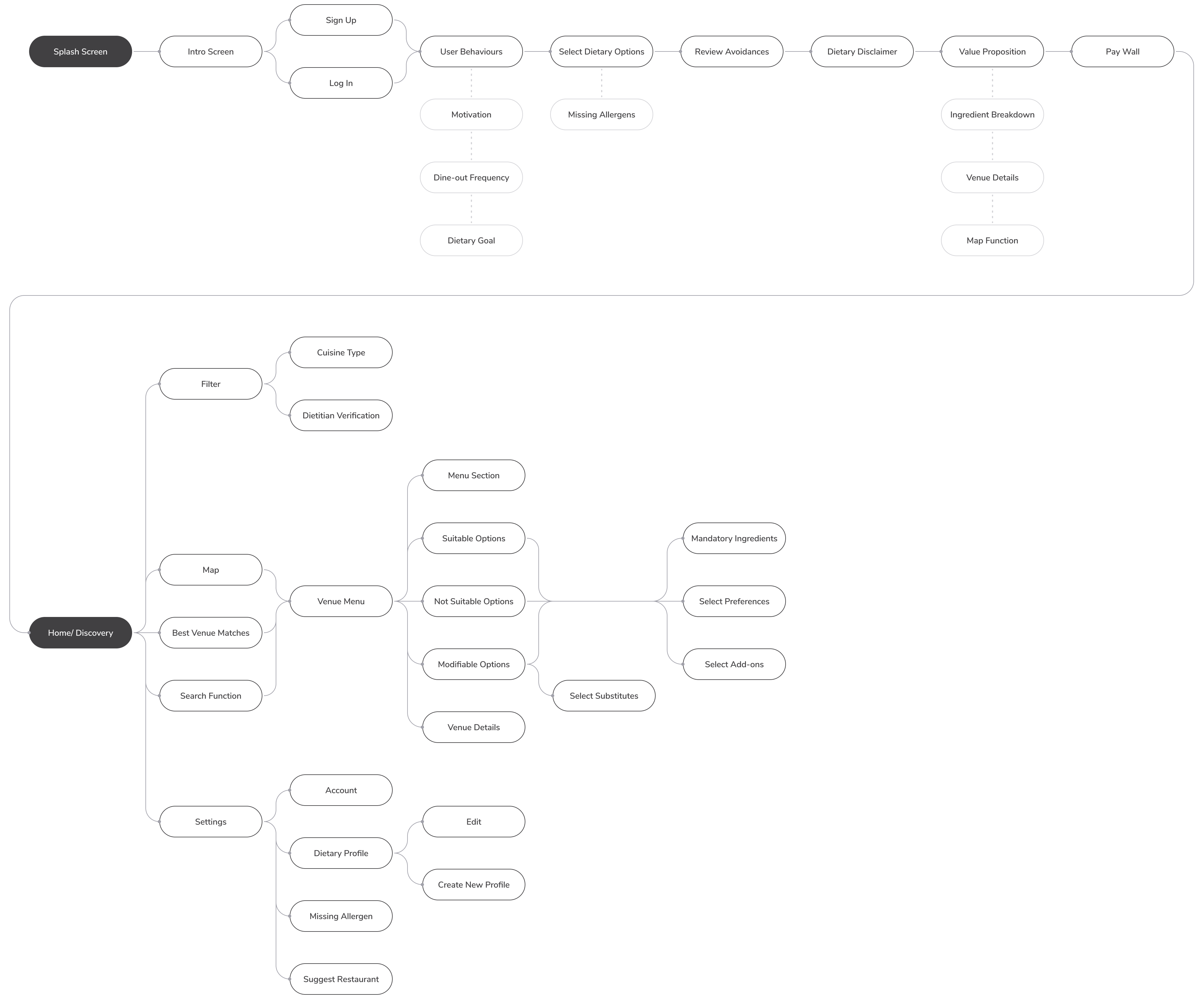
User Flow
Ideation
Typeface
Nunito Sans
Regular
SemiBold
Bold
Aa Bb Cc Dd Ee Ff Gg Hh Ii Jj Kk Ll Mm Nn Oo Pp Qq Rr Ss Tt Uu Vv Ww Xx Yy Zz
1 2 3 4 5 6 7 8 9 0
#f1f2f2
#414042
#51b078
Solution
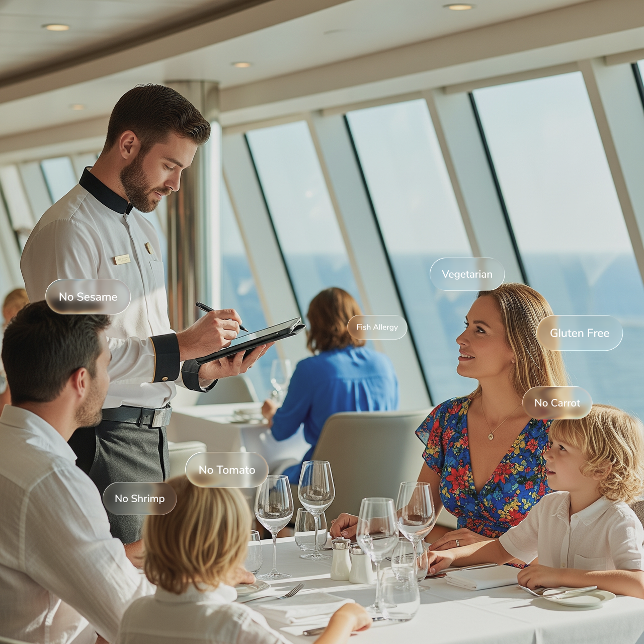
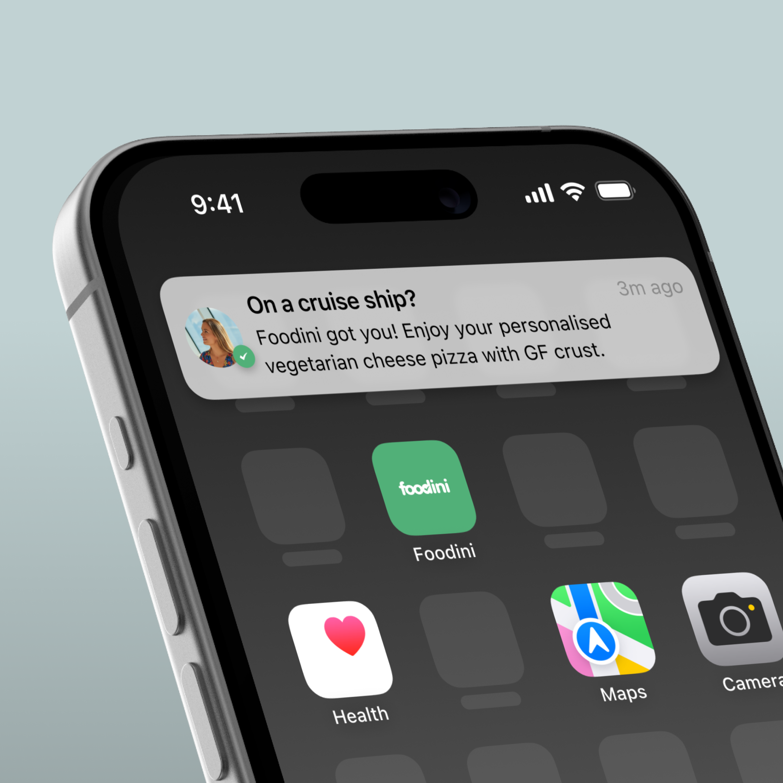
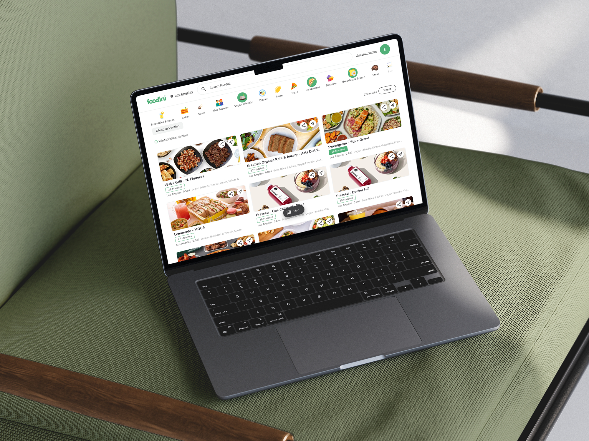
With dietitian expertise laying the foundation, Foodini’s DietaryAI analyses menus and navigate users to available restaurants with accurate and up-to-date ingredient data in seconds.
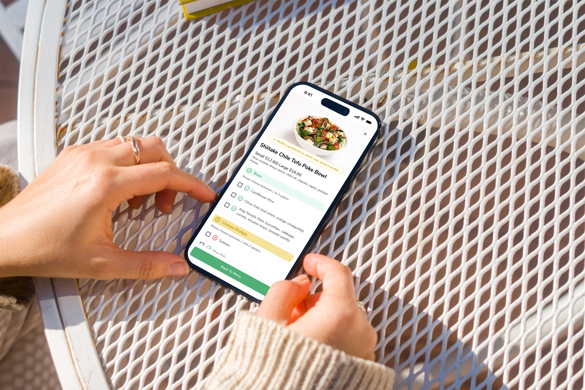
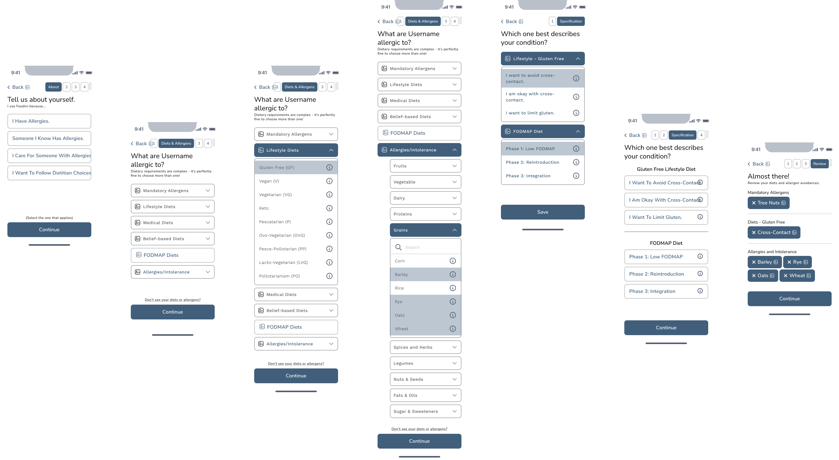
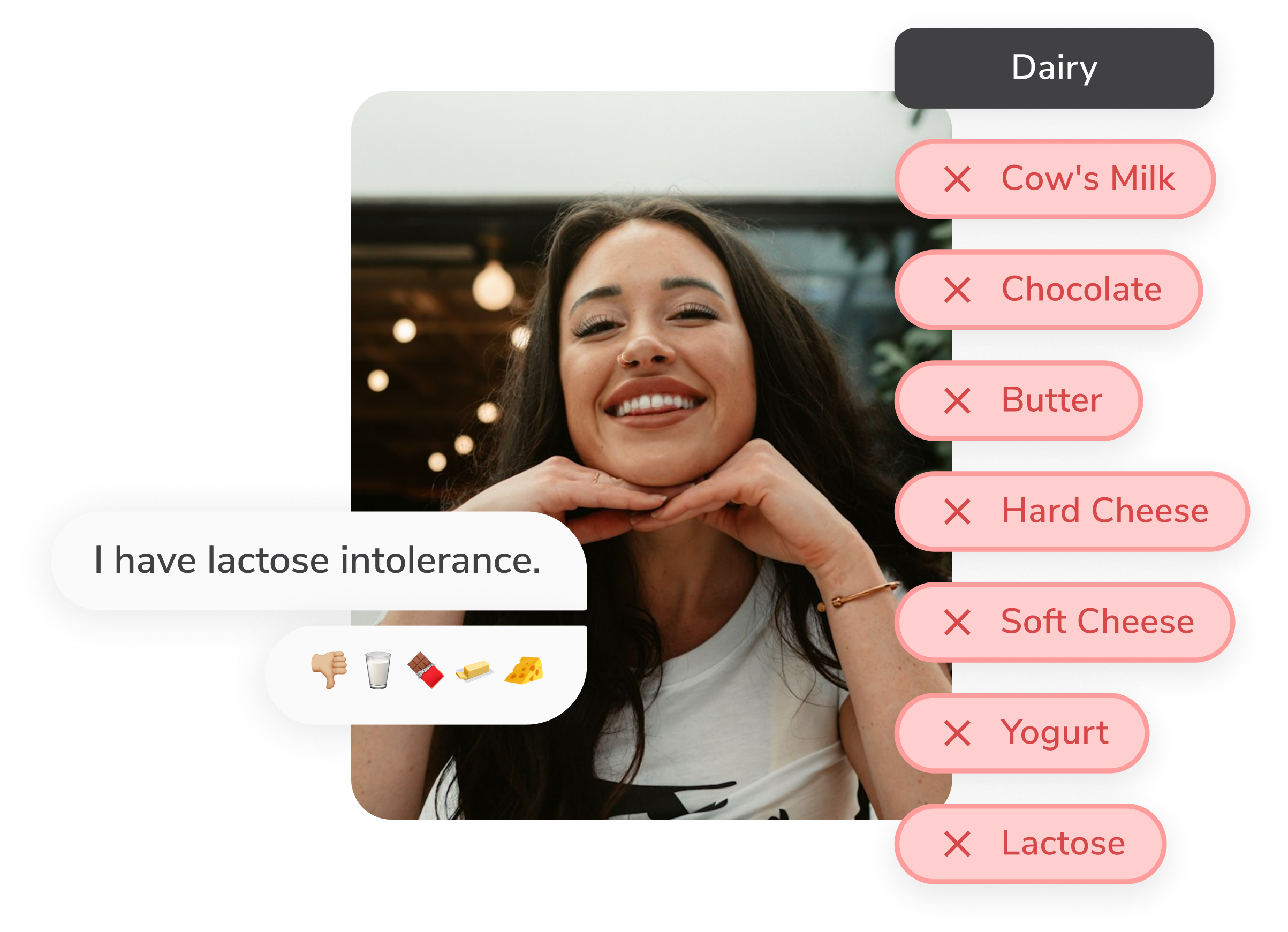
We’ve made it easier to create personalised profiles from 150+ diets and allergens.
Designs help users to see every food avoidances within their dietary goals.
Due to technical constraints, the selection from the search is considered as creating a custom diet, which the search bar is put below the fold intentionally.
The report feature ensures Foodini keep tracks of new dietary trends.
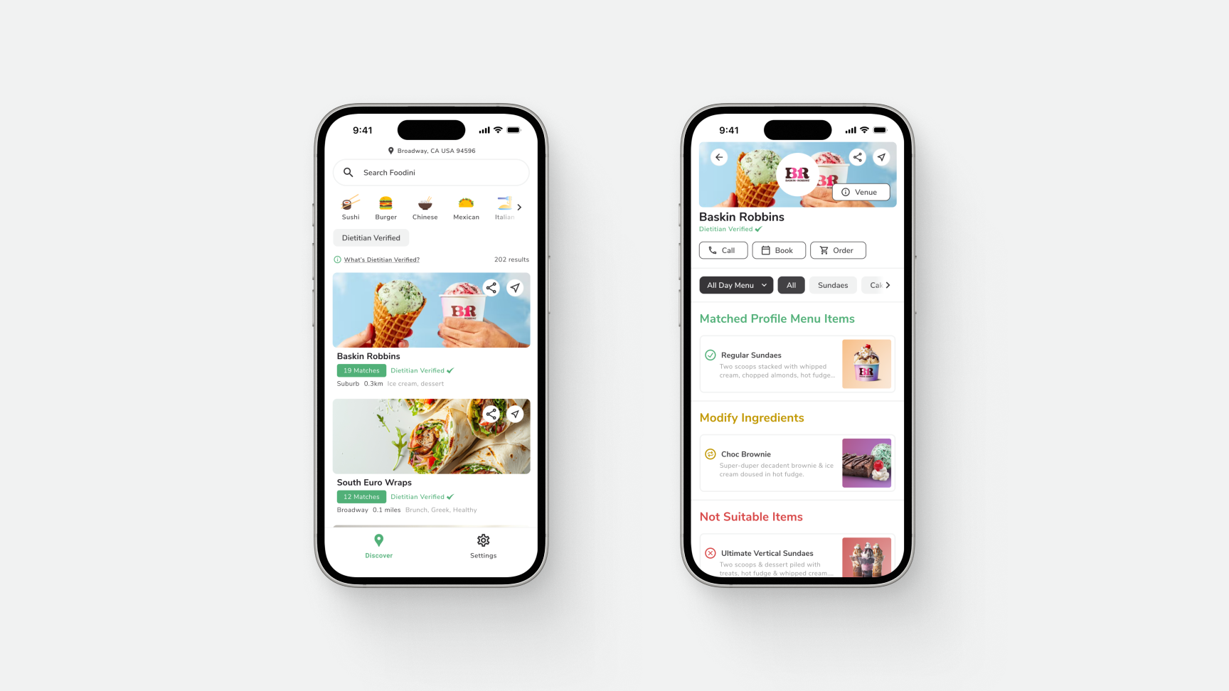
We implemented a traffic light mechanism to help users differentiate which dish is suitable for them (matched to their profiles).
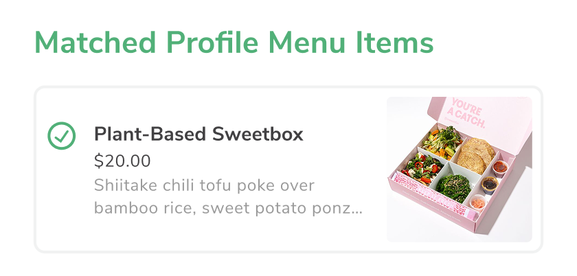
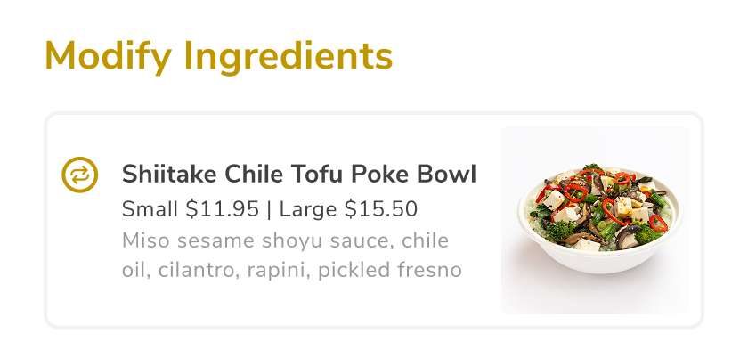
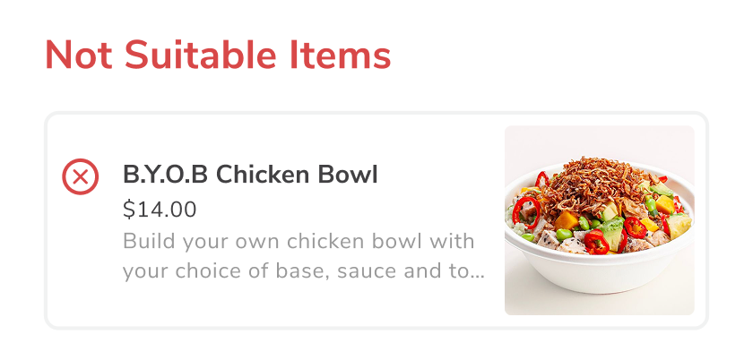
Users gain full control over the menu items with available ingredient adjustments.
Designs set users free from dietary communication with under-informed restaurant staffs.
Result
The Foodini web and mobile apps have revolutionised dine-out and online ordering experience with smart combination of human dietitian and AI.
The web app successfully handled 2,000+ sports fans across 18 food vendors during the 2025 Sydney United Cup.

The mobile app saw a 7x increase in weekly installations, climbing from 32 to a peak of 239.
(Please set your location to Los Angeles, United States)
Future Steps
Explore alternatives to bring the dietary search bar to the top of the dietary profile creation screen and does not break the business logic of creating custom diet.
Having multiple dietary profile creations, as it allows for flexibility with families and groups with diverse dietary preferences.
Implementing review feature, as it builds an engaging dietary-friendly community, and pushes B2C2B by leveraging consumer influence.
Eva Chiu
Let’s Chat
What is Foodini?
Foodini is an AI-driven personalised dietary menu finder powered by accredited practising dietitian.

Industries
Technology, Hospitality, Lifestyle

Location
Launched in Los Angeles, USA
Designed in Sydney, Australia
Team Composition
Chief Operation Officer,
Head of Dietitian,
Head of Technology,
1 Senior Backend Engineer,
1 UI/UX Designer(That’s me 👋🏻)
Project Timeframe
9 Months
Design System
Flutter
Impact
7x
Weekly Installation Growth in 6 months
2880+ users with a 5.8% accumulative growth rate on installations.
4000+
Venues Available on the platform
Including leading restaurants and hotels, such as Crown Melbourne, Sweetgreen, RMD Group, Marriott.
150+
Diets & Allergens Covered
Met SB68 compliance requirements and working towards including calories and nutrition facts.
Foodini was established in 2021 in response to the prevalence of food allergies and hassle involved in finding suitable food.
As the company looks to scale globally, its outdated UI and UX need a refresh to excite consumers worldwide.
Timeline
2024
April

May
June
July
August
September
October
November
Research
UI/UX Designer
Brainstorm
COO, Dietitian, UI/UX Designer
Wireframes & Iterations
UI/UX Designer
Hi-Fi Designs
UI/UX Designer
Development
CTO & Senior Backend Engineer
Testing
Whole team
Friction Points
“ Right idea,
layout needs work.
— The idea behind the app is good but the layout and usability is awkward. Not very intuitive to update dietary preference. (App Store Review)

Suboptimal Prioritisation of Critical Information
The "Select eating preferences" section is placed above "Select allergies." For users with severe allergies, selection of allergen avoidance is more critical and should arguably be prioritised for immediate visibility.
The current section order delays users from inputting their most vital safety information, causing frustration and a feeling that the app doesn't immediately address their primary concern.


Misapplication of the Brand Colour
The app pervasively uses the brand colour green for both dietary selections and allergen exclusions. Green typically indicates positive selection, but here it's also used to mark foods users want to avoid.
This contradictory visual language can lead to confusion and compromise the user's ability to quickly and accurately identify critical dietary restrictions.


Limited Clarity of Interaction and User Expectation
By placing an information icon within selection buttons, the app conflates two distinct actions – selecting an item and accessing supplementary information – into a single, ambiguous tap target. Users may accidentally select/deselect an allergy when seeking information, leading to confusion and hindering predictable interaction, particularly crucial in an app handling sensitive dietary restrictions.
This design choice contradicts user expectations, as tapping a button is intuitively understood to trigger its primary function.

Inconsistency in Visual Language and Interaction Patterns
The design is using two distinctive UIs, toggles for binary "on/off" FODMAP preferences and rectangular buttons for allergies or general eating preferences) to serve the same ‘tapping to select’ action.
Plus, the green ‘exclude’ text next to the toggles does not respond to the on/off interaction.
Users struggle to quickly understand the precise nature and implication of their action (do I turn a feature on/off successfully?), leading to a less intuitive experience.
Diminished goal gradient effect and User Fatigue
By having all dietary categories on a single, long screen with the proceed CTA button at the very bottom, the user lacks a clear visual indication of how much progress they've made or how much remains to be done. They don't see the "finish line" getting closer.
This decreases users’ initial motivation because the reward (a completed profile) seems distant and requires a lot of effort to reach.

Lack of User Control
When a user chooses an eating preference, the system automatically pre-selects corresponding allergies in the 'Select Allergies' section. However, users cannot deselect these auto-selected allergies, which frustrates them and undermines their sense of control.
Low Visual Hierarchy and Less Refined Layout
The inconsistency on paddings and over-reliance on the brand green colour created a less refined interface appearance.
This creates a disconnection between what users want to do and what the system allows, limiting their ability to manage their own dietary preferences.
Appropriate padding would better distinguish between different information sections and enhance overall readability.

Competitor
Analysis
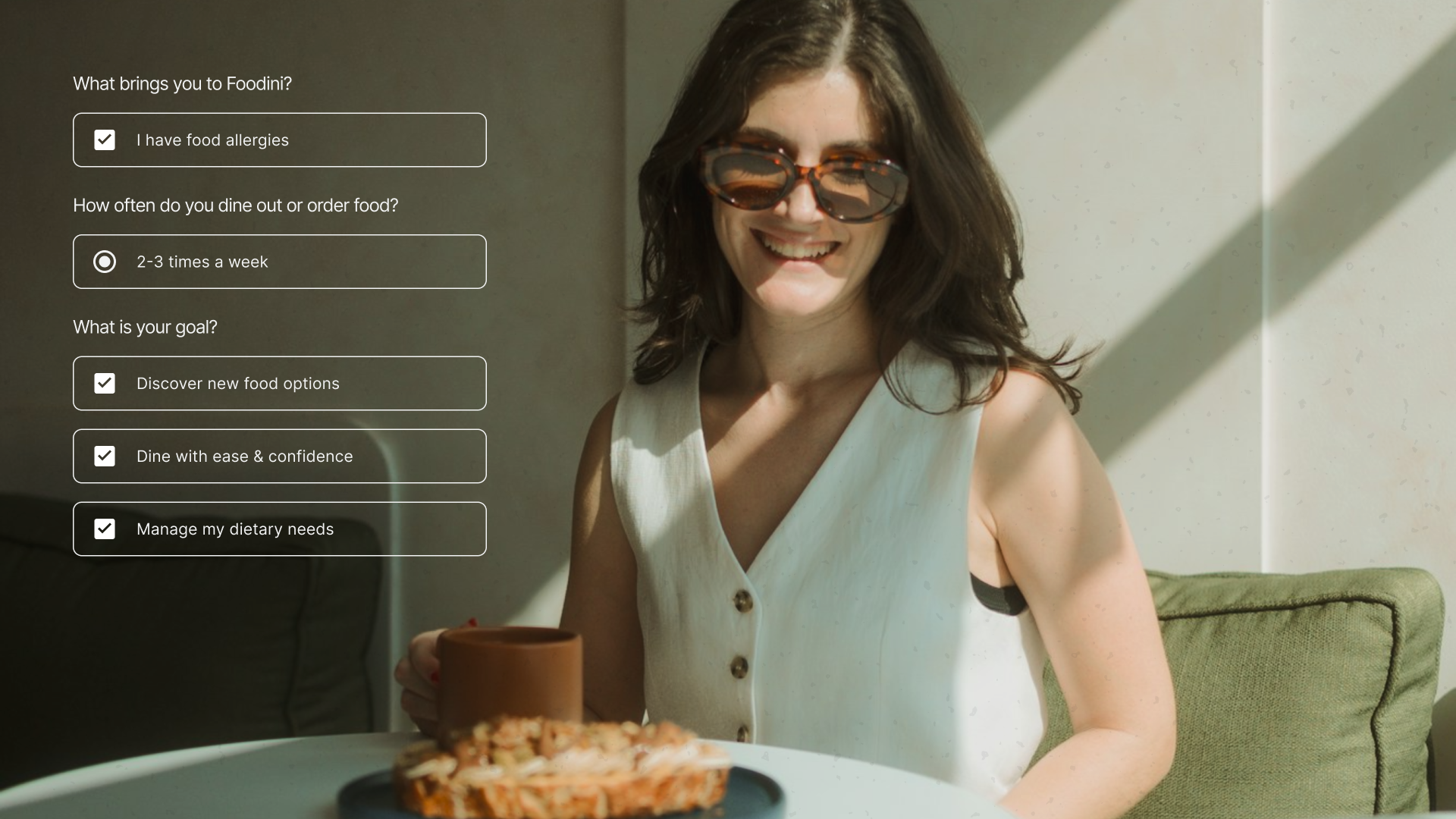
Dietary needs are personal and unique to each individual, requiring:
High Personalisation
Comprehensive dietary options
Intuitive Navigation
Easily selecting/editing dietary preferences
Reassurance
Feeling understood by the technology and reassured with dietitian support
User Flow
Ideation
Typeface
Nunito Sans
Regular
SemiBold
Bold
Aa Bb Cc Dd Ee Ff Gg Hh Ii Jj Kk Ll Mm Nn Oo Pp Qq Rr Ss Tt Uu Vv Ww Xx Yy Zz
1 2 3 4 5 6 7 8 9 0
#f1f2f2
#414042
#51b078
Solution
With dietitian expertise laying the foundation, Foodini’s DietaryAI analyses menus and navigate users to available restaurants with accurate and up-to-date ingredient data in seconds.
We’ve made it easier to create personalised profiles from 150+ diets and allergens.
Designs help users to see every food avoidances within their dietary goals.
Due to technical constraints, the selection from the search is considered as creating a custom diet, which the search bar is put below the fold intentionally.
The report feature ensures Foodini keep tracks of new dietary trends.
We implemented a traffic light mechanism to help users differentiate which dish is suitable for them (matched to their profiles).
Users gain full control over the menu items with available ingredient adjustments.
Designs set users free from dietary communication with under-informed restaurant staffs.
Result
The Foodini web and mobile apps have revolutionised dine-out and online ordering experience with smart combination of human dietitian and AI.
The web app successfully handled 2,000+ sports fans across 18 food vendors during the 2025 Sydney United Cup.
The mobile app saw a 7x increase in weekly installations, climbing from 32 to a peak of 239.
(Please set your location to Los Angeles, United States)
Future Steps
Explore alternatives to bring the dietary search bar to the top of the dietary profile creation screen and does not break the business logic of creating custom diet.
Having multiple dietary profile creations, as it allows for flexibility with families and groups with diverse dietary preferences.
Implementing review feature, as it builds an engaging dietary-friendly community, and pushes B2C2B by leveraging consumer influence.
Eva Chiu
Let’s Chat
Foodini is an AI-driven personalised dietary menu finder powered by accredited practising dietitian.
What is Foodini?

Industries
Technology, Hospitality, Lifestyle

Location
Launched in Los Angeles, USA
Designed in Sydney, Australia
Team Composition
Chief Operation Officer,
Head of Dietitian,
Head of Technology,
1 Senior Backend Engineer,
1 UI/UX Designer(That’s me 👋🏻)
Project Timeframe
9 Months
Design System
Flutter
Impact
7x
Weekly Installation Growth in 6 months
2880+ users with a 5.8% accumulative growth rate on installations.
4000+
Venues Available on the platform
Including leading restaurants and hotels, such as Crown Melbourne, Sweetgreen, RMD Group, Marriott.
150+
Diets & Allergens Covered
Met SB68 compliance requirements and working towards including calories and nutrition facts.
Foodini was established in 2021 in response to the prevalence of food allergies and hassle involved in finding suitable food.
As the company looks to scale globally, its outdated UI and UX need a refresh to excite consumers worldwide.
Timeline
2024
April

May
June
July
August
September
October
November
Research
UI/UX Designer
Brainstorm
COO, Dietitian, UI/UX Designer
Wireframes & Iterations
UI/UX Designer
Hi-Fi Designs
UI/UX Designer
Development
CTO & Senior Backend Engineer
Testing
Whole team
Friction Points
“ Right idea,
layout needs work.
— The idea behind the app is good but the layout and usability is awkward. Not very intuitive to update dietary preference. (App Store Review)

Suboptimal Prioritisation of Critical Information
The "Select eating preferences" section is placed above "Select allergies." For users with severe allergies, selection of allergen avoidance is more critical and should arguably be prioritised for immediate visibility.
The current section order delays users from inputting their most vital safety information, causing frustration and a feeling that the app doesn't immediately address their primary concern.


Misapplication of the Brand Colour
The app pervasively uses the brand colour green for both dietary selections and allergen exclusions. Green typically indicates positive selection, but here it's also used to mark foods users want to avoid.
This contradictory visual language can lead to confusion and compromise the user's ability to quickly and accurately identify critical dietary restrictions.

Limited Clarity of Interaction and User Expectation
By placing an information icon within selection buttons, the app conflates two distinct actions – selecting an item and accessing supplementary information – into a single, ambiguous tap target. Users may accidentally select/deselect an allergy when seeking information, leading to confusion and hindering predictable interaction, particularly crucial in an app handling sensitive dietary restrictions.
This design choice contradicts user expectations, as tapping a button is intuitively understood to trigger its primary function.

Inconsistency in Visual Language and Interaction Patterns
The design is using two distinctive UIs, toggles for binary "on/off" FODMAP preferences and rectangular buttons for allergies or general eating preferences) to serve the same ‘tapping to select’ action.
Plus, the green ‘exclude’ text next to the toggles does not respond to the on/off interaction.
Users struggle to quickly understand the precise nature and implication of their action (do I turn a feature on/off successfully?), leading to a less intuitive experience.
Diminished goal gradient effect and User Fatigue
By having all dietary categories on a single, long screen with the proceed CTA button at the very bottom, the user lacks a clear visual indication of how much progress they've made or how much remains to be done. They don't see the "finish line" getting closer.
This decreases users’ initial motivation because the reward (a completed profile) seems distant and requires a lot of effort to reach.

Lack of User Control
When a user chooses an eating preference, the system automatically pre-selects corresponding allergies in the 'Select Allergies' section. However, users cannot deselect these auto-selected allergies, which frustrates them and undermines their sense of control.
Low Visual Hierarchy and Less Refined Layout
The inconsistency on paddings and over-reliance on the brand green colour created a less refined interface appearance.
This creates a disconnection between what users want to do and what the system allows, limiting their ability to manage their own dietary preferences.
Appropriate padding would better distinguish between different information sections and enhance overall readability.

Competitor
Analysis
Dietary needs are personal and unique to each individual, requiring:
High Personalisation
Comprehensive dietary options
Intuitive Navigation
Easily selecting/editing dietary preferences
Reassurance
Feeling understood by the technology and reassured with dietitian support
User Flow
Ideation
Typeface
Nunito Sans
Regular
SemiBold
Bold
Aa Bb Cc Dd Ee Ff Gg Hh Ii Jj Kk Ll Mm Nn Oo Pp Qq Rr Ss Tt Uu Vv Ww Xx Yy Zz
1 2 3 4 5 6 7 8 9 0
#f1f2f2
#414042
#51b078
Solution
With dietitian expertise laying the foundation, Foodini’s DietaryAI analyses menus and navigate users to available restaurants with accurate and up-to-date ingredient data in seconds.
We’ve made it easier to create personalised profiles from 150+ diets and allergens.
Designs help users to see every food avoidances within their dietary goals.
Due to technical constraints, the selection from the search is considered as creating a custom diet, which the search bar is put below the fold intentionally.
The report feature ensures Foodini keep tracks of new dietary trends.
We implemented a traffic light mechanism to help users differentiate which dish is suitable for them (matched to their profiles).
Users gain full control over the menu items with available ingredient adjustments.
Designs set users free from dietary communication with under-informed restaurant staffs.
Result
The Foodini web and mobile apps have revolutionised dine-out and online ordering experience with smart combination of human dietitian and AI.
The web app successfully handled 2,000+ sports fans across 18 food vendors during the 2025 Sydney United Cup.
The mobile app saw a 7x increase in weekly installations, climbing from 32 to a peak of 239.
(Please set your location to Los Angeles, United States)
Future Steps
Explore alternatives to bring the dietary search bar to the top of the dietary profile creation screen and does not break the business logic of creating custom diet.
Having multiple dietary profile creations, as it allows for flexibility with families and groups with diverse dietary preferences.
Implementing review feature, as it builds an engaging dietary-friendly community, and pushes B2C2B by leveraging consumer influence.
Eva Chiu
Let’s Chat
Foodini is an AI-driven personalised dietary menu finder powered by accredited practising dietitian.
What is Foodini?

Industries
Technology, Hospitality, Lifestyle

Location
Launched in Los Angeles, USA
Designed in Sydney, Australia
Team Composition
Chief Operation Officer,
Head of Dietitian,
Head of Technology,
1 Senior Backend Engineer,
1 UI/UX Designer(That’s me 👋🏻)
Project Timeframe
9 Months
Design System
Flutter
Impact
7x
Weekly Installation Growth in 6 months
2880+ users with a 5.8% accumulative growth rate on installations.
4000+
Venues Available on the platform
Including leading restaurants and hotels, such as Crown Melbourne, Sweetgreen, RMD Group, Marriott.
150+
Diets & Allergens Covered
Met SB68 compliance requirements and working towards including calories and nutrition facts.
Foodini was established in 2021 in response to the prevalence of food allergies and hassle involved in finding suitable food.
As the company looks to scale globally, its outdated UI and UX need a refresh to excite consumers worldwide.
2024
Timeline
April

May
June
July
August
September
October
November
Research
UI/UX Designer
Brainstorm
COO, Dietitian, UI/UX Designer
Wireframes & Iterations
UI/UX Designer
Hi-Fi Designs
UI/UX Designer
Development
CTO & Senior Backend Engineer
Testing
Whole team
Friction Points
“ Right idea,
layout needs work.
— The idea behind the app is good but the layout and usability is awkward. Not very intuitive to update dietary preference. (App Store Review)

Suboptimal Prioritisation of Critical Information
The "Select eating preferences" section is placed above "Select allergies." For users with severe allergies, selection of allergen avoidance is more critical and should arguably be prioritised for immediate visibility.
The current section order delays users from inputting their most vital safety information, causing frustration and a feeling that the app doesn't immediately address their primary concern.


Misapplication of the Brand Colour
The app pervasively uses the brand colour green for both dietary selections and allergen exclusions. Green typically indicates positive selection, but here it's also used to mark foods users want to avoid.
This contradictory visual language can lead to confusion and compromise the user's ability to quickly and accurately identify critical dietary restrictions.


Limited Clarity of Interaction and User Expectation
By placing an information icon within selection buttons, the app conflates two distinct actions – selecting an item and accessing supplementary information – into a single, ambiguous tap target. Users may accidentally select/deselect an allergy when seeking information, leading to confusion and hindering predictable interaction, particularly crucial in an app handling sensitive dietary restrictions.
This design choice contradicts user expectations, as tapping a button is intuitively understood to trigger its primary function.

Inconsistency in Visual Language and Interaction Patterns
The design is using two distinctive UIs, toggles for binary "on/off" FODMAP preferences and rectangular buttons for allergies or general eating preferences) to serve the same ‘tapping to select’ action.
Plus, the green ‘exclude’ text next to the toggles does not respond to the on/off interaction.
Users struggle to quickly understand the precise nature and implication of their action (do I turn a feature on/off successfully?), leading to a less intuitive experience.
Diminished goal gradient effect and User Fatigue
By having all dietary categories on a single, long screen with the proceed CTA button at the very bottom, the user lacks a clear visual indication of how much progress they've made or how much remains to be done. They don't see the "finish line" getting closer.
This decreases users’ initial motivation because the reward (a completed profile) seems distant and requires a lot of effort to reach.

Lack of User Control
When a user chooses an eating preference, the system automatically pre-selects corresponding allergies in the 'Select Allergies' section. However, users cannot deselect these auto-selected allergies, which frustrates them and undermines their sense of control.
Low Visual Hierarchy and Less Refined Layout
The inconsistency on paddings and over-reliance on the brand green colour created a less refined interface appearance.
This creates a disconnection between what users want to do and what the system allows, limiting their ability to manage their own dietary preferences.

Appropriate padding would better distinguish between different information sections and enhance overall readability.

Competitor
Analysis
Dietary needs are personal and unique to each individual, requiring:
High Personalisation
Comprehensive dietary options
Intuitive Navigation
Easily selecting/editing dietary preferences
Reassurance
Feeling understood by the technology and reassured with dietitian support
User Flow
Ideation
Typeface
Nunito Sans
Regular
SemiBold
Bold
Aa Bb Cc Dd Ee Ff Gg Hh Ii Jj Kk Ll Mm Nn Oo Pp Qq Rr Ss Tt Uu Vv Ww Xx Yy Zz
1 2 3 4 5 6 7 8 9 0
#f1f2f2
#414042
#51b078
Solution
With dietitian expertise laying the foundation, Foodini’s DietaryAI analyses menus and navigate users to available restaurants with accurate and up-to-date ingredient data in seconds.
We’ve made it easier to create personalised profiles from 150+ diets and allergens.
Designs help users to see every food avoidances within their dietary goals.
Due to technical constraints, the selection from the search is considered as creating a custom diet, which the search bar is put below the fold intentionally.
The report feature ensures Foodini keep tracks of new dietary trends.
We implemented a traffic light mechanism to help users differentiate which dish is suitable for them (matched to their profiles).
Users gain full control over the menu items with available ingredient adjustments.
Designs set users free from dietary communication with under-informed restaurant staffs.
Result
The Foodini web and mobile apps have revolutionised dine-out and online ordering experience with smart combination of human dietitian and AI.
The web app successfully handled 2,000+ sports fans across 18 food vendors during the 2025 Sydney United Cup.
The mobile app saw a 7x increase in weekly installations, climbing from 32 to a peak of 239.
(Please set your location to Los Angeles, United States)
Future Steps
Explore alternatives to bring the dietary search bar to the top of the dietary profile creation screen and does not break the business logic of creating custom diet.
Having multiple dietary profile creations, as it allows for flexibility with families and groups with diverse dietary preferences.
Implementing review feature, as it builds an engaging dietary-friendly community, and pushes B2C2B by leveraging consumer influence.